
3
Min. ReadAre watch lovers who are fed with the hegemony of black, white, and all the tones in between, looking for a solution by going out of line?
While I was discussing current issues in the world of horology at an event I attended recently, the topic inevitably came to the unbelievable selling price of the Nautilus 5711, produced in collaboration with Patek Philippe and Tiffany & Co. After discussing all possible causes, I decided that one contributing factor in achieving this unreasonable price level deserves more attention than the others: Color.

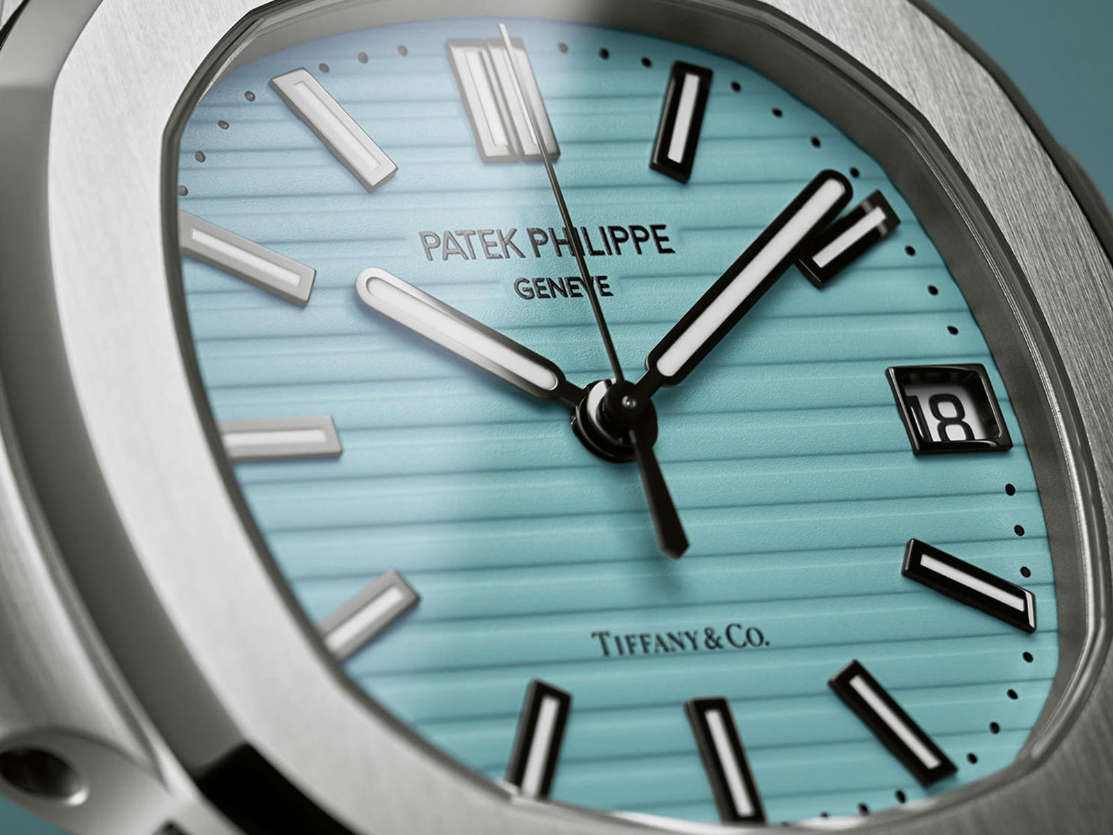
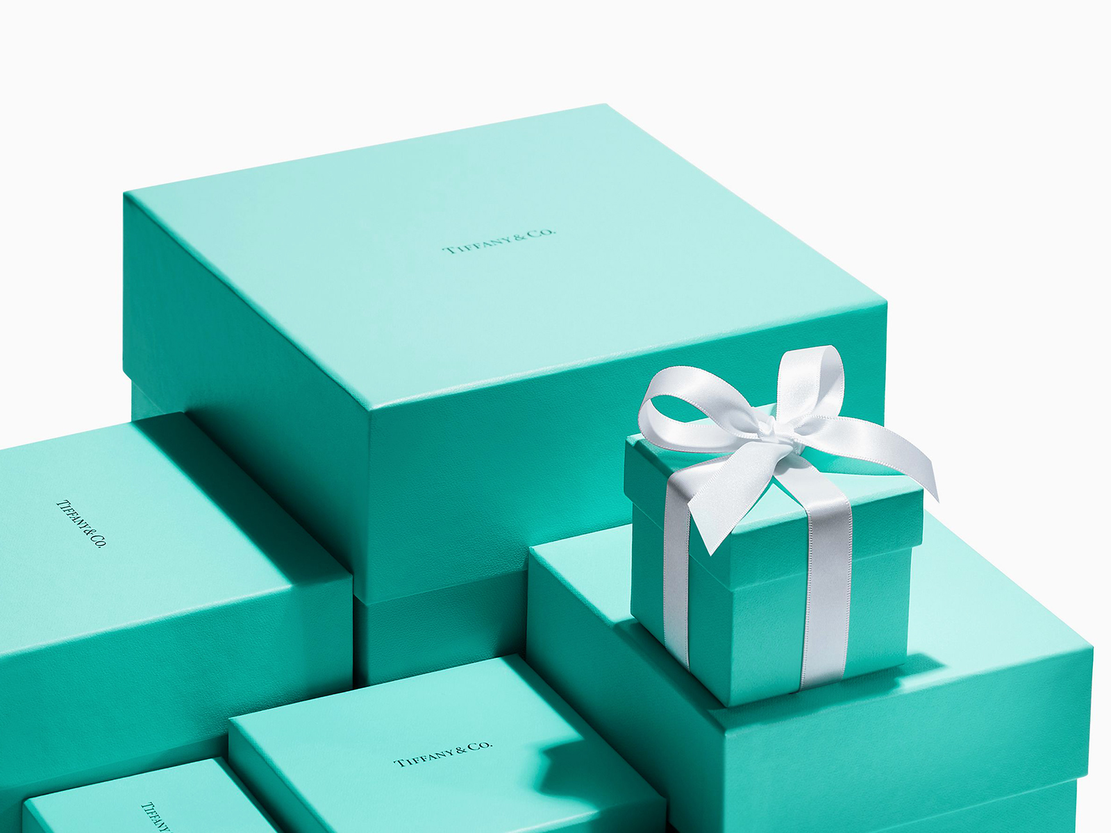
There is a story behind the blue color associated with the Tiffany & Co brand. The tone used mostly in the advertisements and boxes of the brand, founded in 1837 by Charles Tiffany and John Young, comes from the egg of the American Robin. Over the years, Tiffany & Co has become such a big brand that this blue color was registered in 1998 as Tiffany blue and managed to enter the Pantone color scale with reference number 1837.
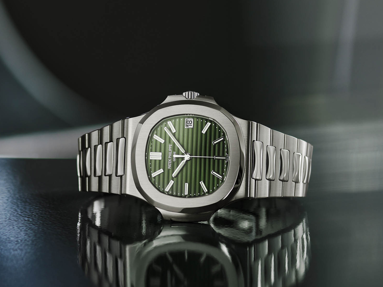
Let's go back to the 5711 in the leading role. The model already had a very successful blue dial in its standard form. The white version, which later joined the collection, likewise benefited greatly from the reputation of the Nautilus name. So, what about green? I'm a little confused about that. Do you think the green version would have received the same amount of attention if it had been released in blue and white at the same time as an unlimited number of productions? Or, is it the color or the "limited edition Patek" definition with a high investment value among the buying motivations of those who own/desire to own the green 5711?

Of course, it is possible to apply the same questions to the 5711 Tiffany, but in this scenario, the further I am from the green, the closer I feel to the 5711 Tiffany blue. Finally, we have a vivacious Patek that has broken the monotony. I wonder what our reaction would be if we saw this exclusive color in models like the Rolex Daytona or Audemars Piguet Royal Oak Jumbo, which are among the other watches that dominate the market? Especially with Tiffany & Co text on the dial.


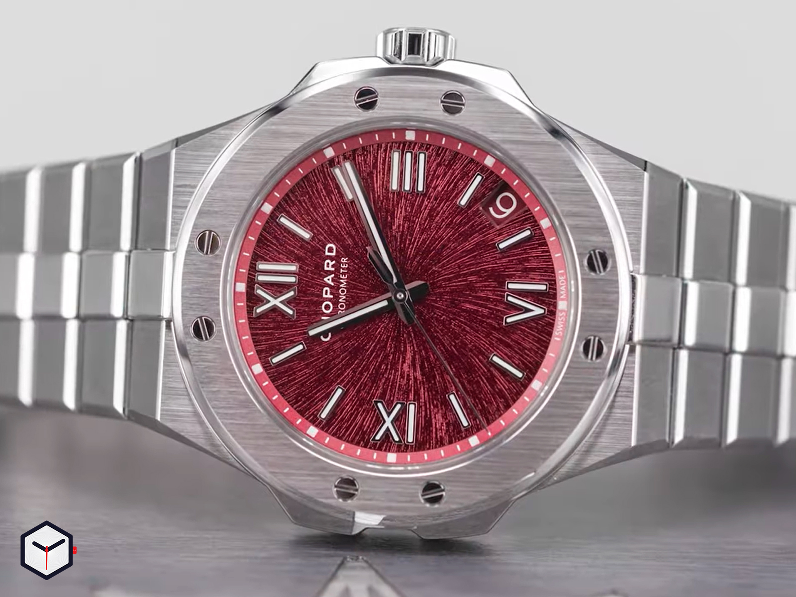
Isn't it stunning? Brands should also be aware of this effect, that models equipped with dials with bold colors are launched one after another. The success of Rolex's Oyster Perpetual family is a solid example in this regard. The international interest in Chopard Alpine Eagle Horobox Edition was also worth noting. What about the Oris Aquis Date Upcycle model? Keyword: Color!


We are not rediscovering America, of course. The dial color topic has been on the agenda for many years, and, unfortunately, we had the opportunity to talk about just one of the hundreds of factors that affect the success of a watch. In a recent get-together, there was a bet on which color would become more popular in the next few years. I voted for red. What color would you vote for?


